Jivagro strives to secure the goodness that we seek in our food, at the very roots of where it is produced. The farms that ensure the nutritional value of the horticulture produce, is at the heart of Jivagro’s superior range of specialised products. Jivagro had a vast portfolio of such products, but lacked that differentiation, distinctiveness and the essence of its organisational values. The challenge was to create a differentiated packaging for Jivagro that establishes it as a horticare specialist, and becomes a benchmark for this new category.
Jivagro not only cares for the farmers it partners with, but also believes in going a step further by ensuring the high nutritional value of its produce. Its farmers are conscientious growers who are uncompromising on quality and don’t believe in a trade-off for quantity. Thus, we clearly identified and mapped out values of competency, vibrancy and honesty that sits at the heart of its personality. This needed to translate into the form and feel of the packaging design. Brand values like speed, trust, adaptability and innovation were earmarked before kickstarting design. We also understood that the larger purpose of becoming an innovative and sustainable solutions provider needed to come through in the visual appeal of the brand design.
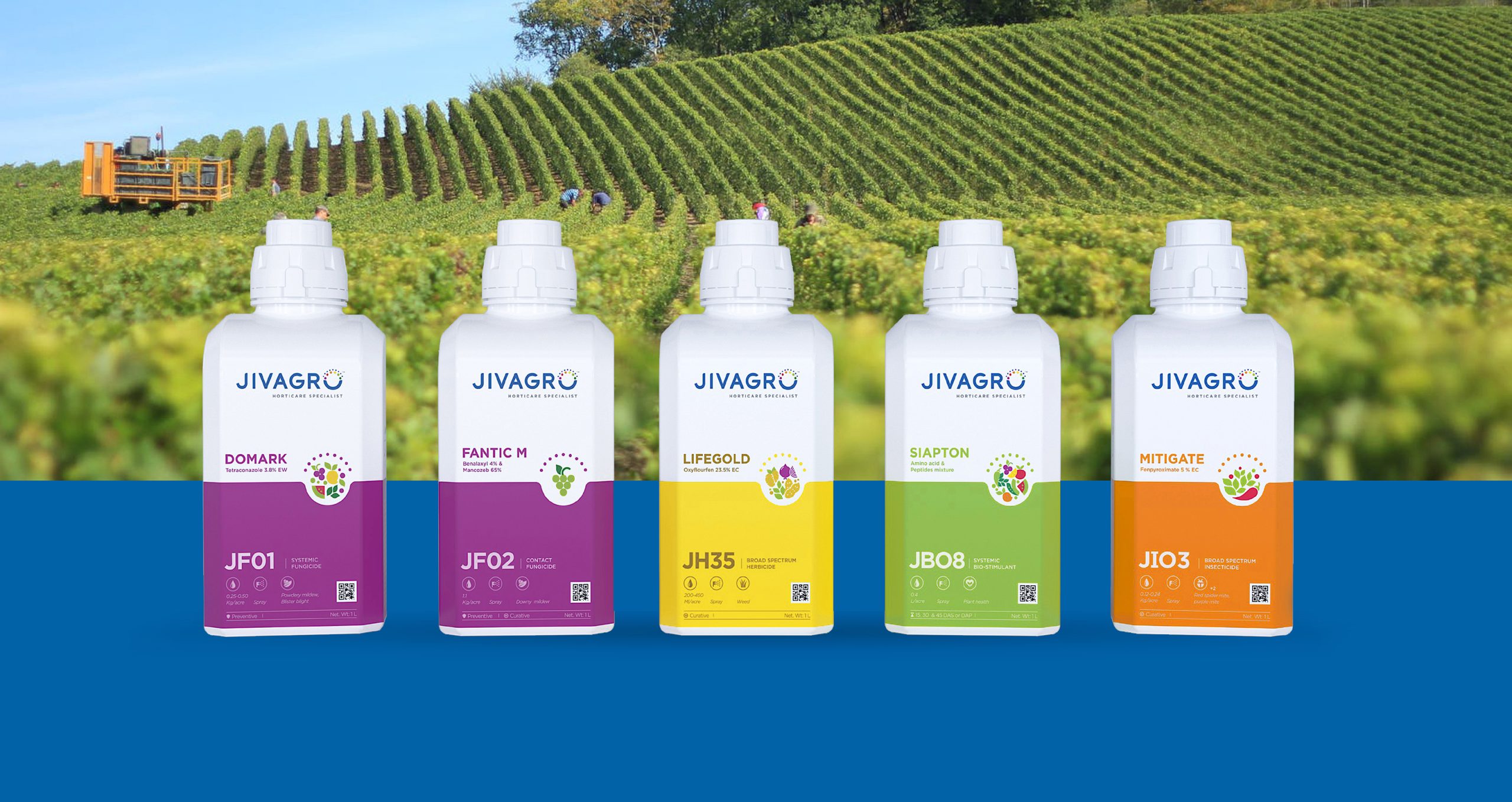
Our next phase was embodying the brand’s core values of goodness and building a strong ownable design language that was consistent yet differentiating across its product portfolio. We sought to distinguish by creating a clear category distinction, from plant care to herbicides, making it easy for the retailer as well as the consumer to identify and associate. We wanted to empower the brand identity by taking a human-centred approach enabling them with correct usage and application of the product, thus unlocking maximum goodness.
It was critical for us to ensure that every Jivagro bottle represents horticulture, the brand identity and the product content. An in-depth category scan revealed the need for harmonizing the portfolio by brand level unification, sharp connection between the structures and the brand and creating a category level distinction.
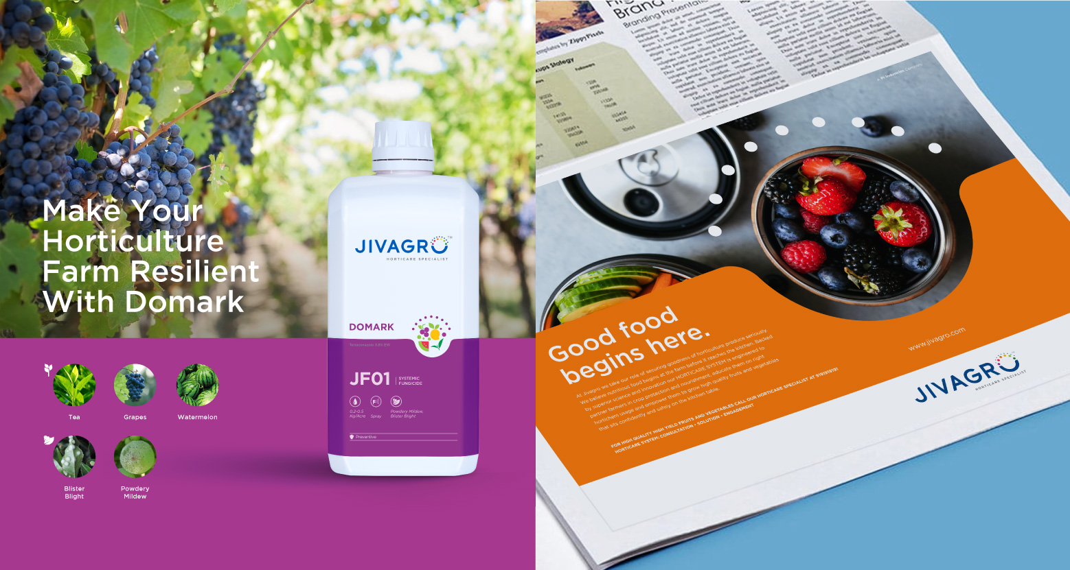
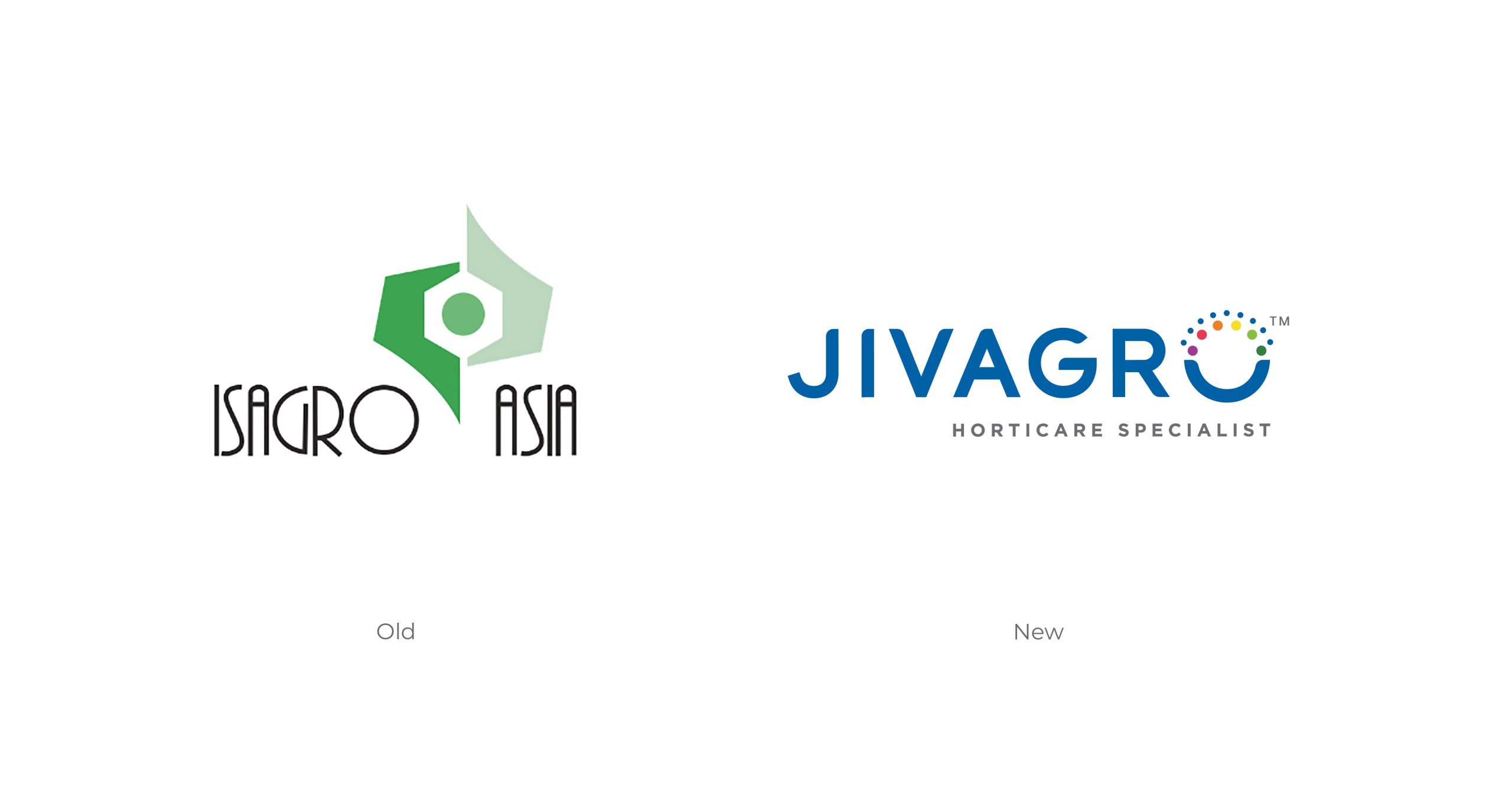
We wanted the identity to encapsulate its progressive outlook and innovation, which we designed into the brand’s logo identity and visual language. The modern styling of the type, with rounded structures, soft edges, balancing curves and straights help achieve a sense of wholesome goodness. The strong base with gentle top and colour coded lettering imbibes the vibrancy of the brand. Each colour chosen represents the problem they solve, while instilling vitality in the crops. The colour palette has been kept lively for this purpose.
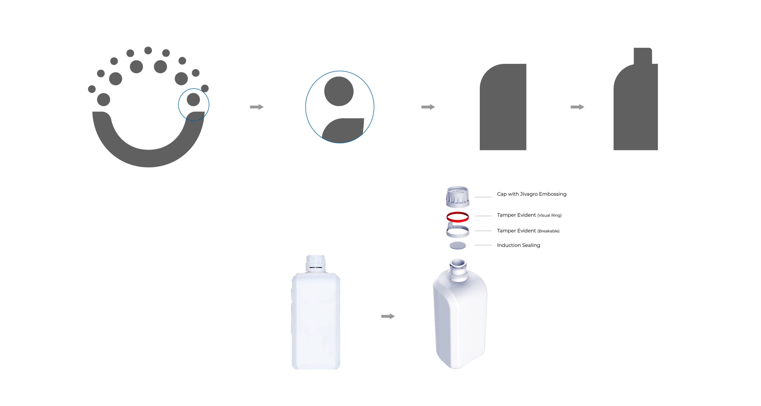
For our inspiration, we looked at body form attributes with cross-category references, from wellness to industrial product designs. We decoded shapes and structures for associations like wholesomeness, nurture and goodness. Aspects of functionality like pour mechanism and brand embodiment like brand elements were also studied.
After multiple explorations, we arrived at the new visual identity itself for form derivation. This was done by creating the initial body lines, achieving the golden ratio and creating the final structural design. The asymmetric body form, with a strong base but rounded from top, gives that balance. Category associations and brand attributes like goodness are showcased by the overall shape. The label is colour coded for distinctiveness and differentiation, with pragmatic interventions like tamperproofing and easy stackability.
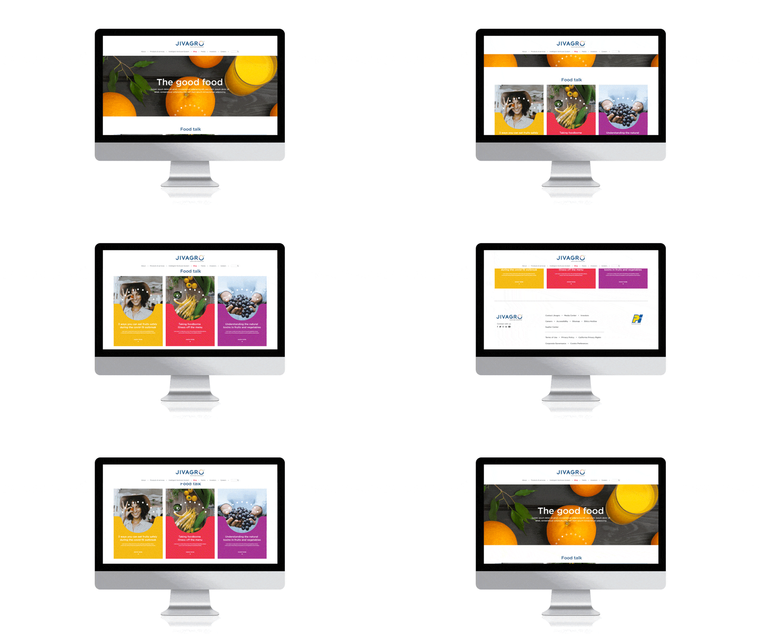
Jivagro is for the meticulous farmer who wants to deliver the best for their consumer’s kitchen. The connection between the nourishment of crops and the goodness of life is an intricate yet wide one. As Jivagro embarks on this journey to bring latest scientific research and build partnerships to find the right solutions, this new identity will only inspire and enliven it’s stakeholders, because innovation is a way of life at Jivagro.