Gemini is a name synonymous with everyday cooking oil across different households of Maharashtra and other key geographies. Equipped with a vast portfolio of several cooking oils meant to enhance taste and enable everyday cooking, the brand found itself at the forefront of unlocking new opportunities for the progressive traditionalist woman. This meant delivering health benefits for the family and helping these women find freedom from the time spent in the kitchen.
The task at hand was to build the packaging design with an effective brand architecture for Gemini, to capture this core need at its heart while appealing to the sensibilities of the progressive traditionalist woman. But, this wouldn’t be accomplished without organizing the Gemini brand architecture and crafting sub-brands with clear distinction and key propositions.
Excessive usage of nomenclatures blurred the benefits or the associated with oils within the health portfolio, lending a vague description to the products. Our key areas of study involved examining two types of brand architectures – multiple sub-brands and single sub-brands. The major outcome of this study showed that a single sub-brand created for a range of products is more effective allowing the brand to stretch by creating multiple offerings without diluting the equity of the master brand. This also aids consumer purchase through a clear benefit communication.
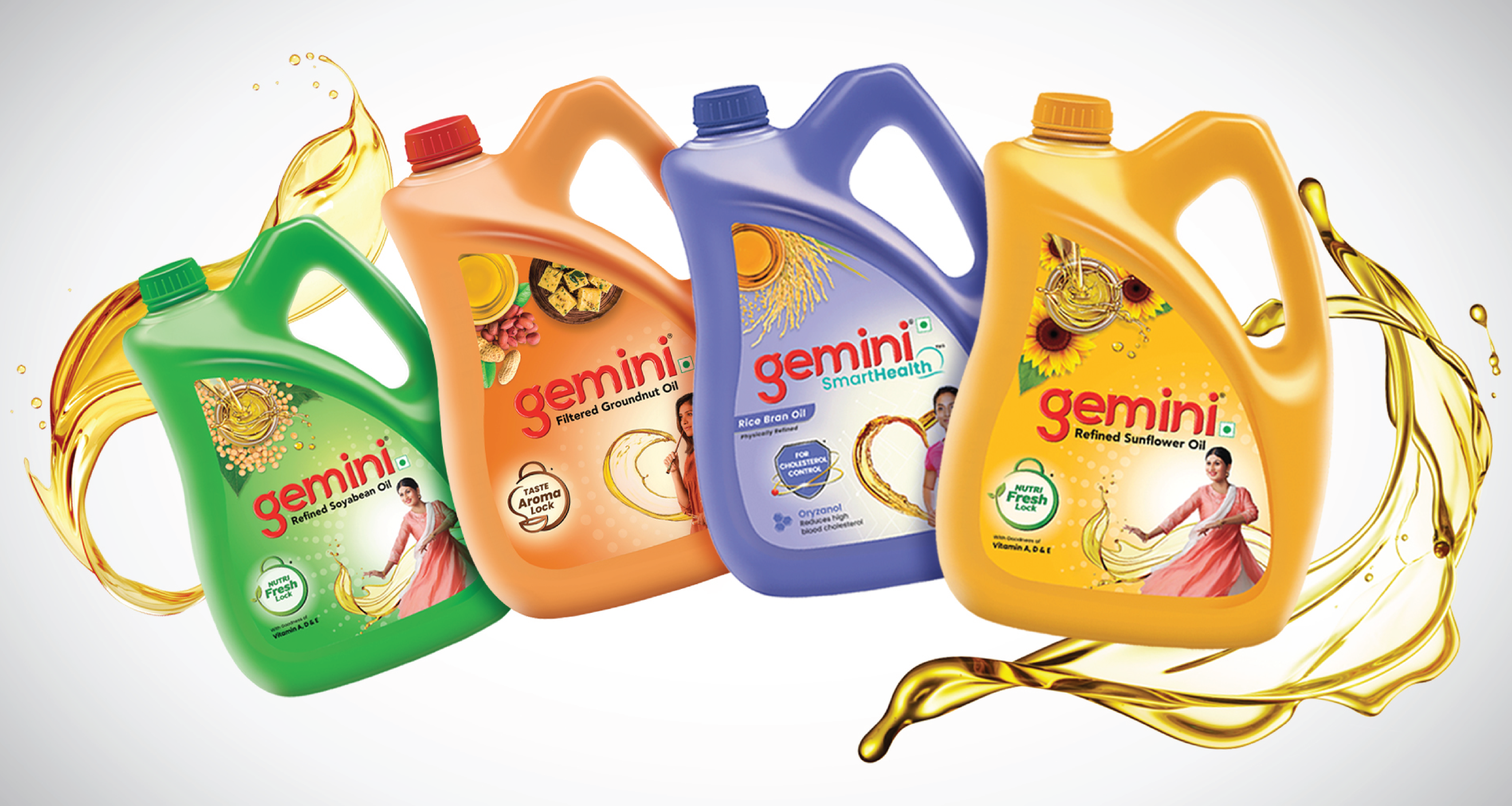
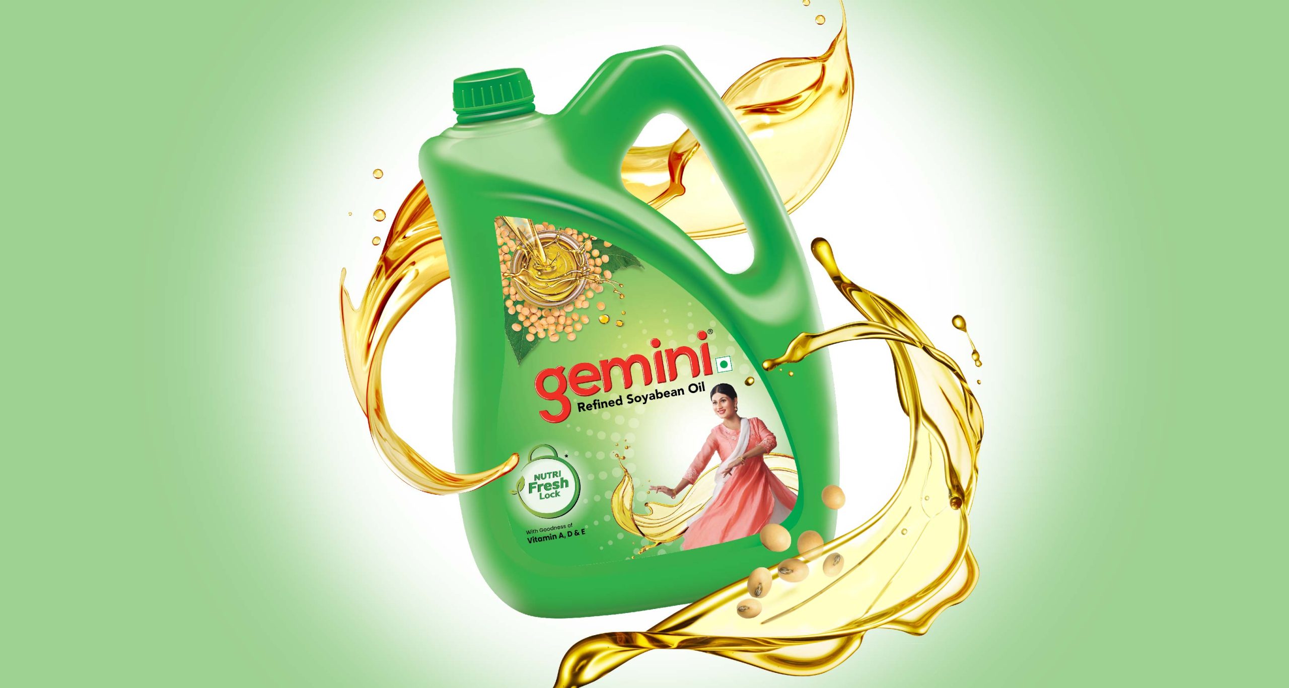
We therefore created narratives across three different categories of oils – tasty oils, everyday oils and healthy oils. The tasty oils were associated with richness of taste and flavour while the everyday oils were defined by goodness and lightness. These narratives would flow through descriptors and visual language.
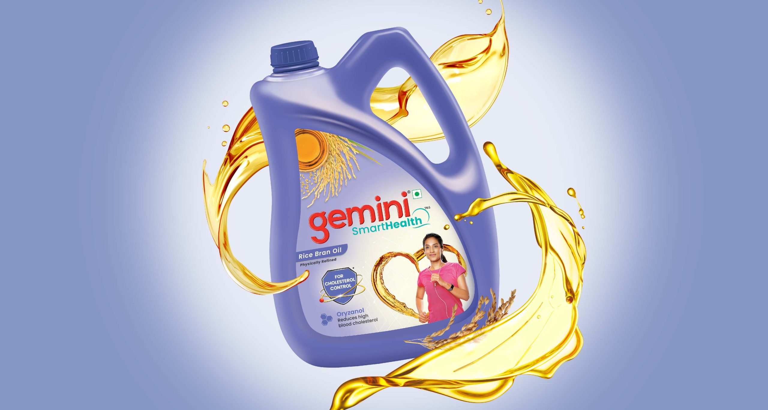
The healthy oils are defined as enablers of good health, that aids an active lifestyle, has low absorption, lowers cholesterol and supports heart health. This clear and distinct benefit demanded a different approach for this category. Thus, a single sub-brand in this space would bring it alive.

Our next task was crafting a sub-brand that would reflect the tenets of Gemini’s health portfolio through it’s nomenclature. This step was crucial, as the portfolio would aid consumers in proactive and preventive lifestyle management. The sub-brand would aid smart consumers of today to take steps towards building a better tomorrow. Hence, the compound name Smarthealth.
The main challenge with designing the mother brand was capturing the essence of the progressive traditionalist woman. She is a nurturer of her family and is an enabler of her “self” at the same time. The task was to showcase balance while standing all for unleashing her potential through a visual language. Unlocking balance which stands for freedom from kitchen time and unleashing individual potential sits at the heart of the brand. Establishing balance in her life – so she can spend time on diverse engagements, beyond kitchen – whether it is pursuing her interests/passions like singing, dancing, painting etc. or taking care of her body and mind.
The idea is brought alive through this design concept which is an interplay and interaction between various elements on the pack.
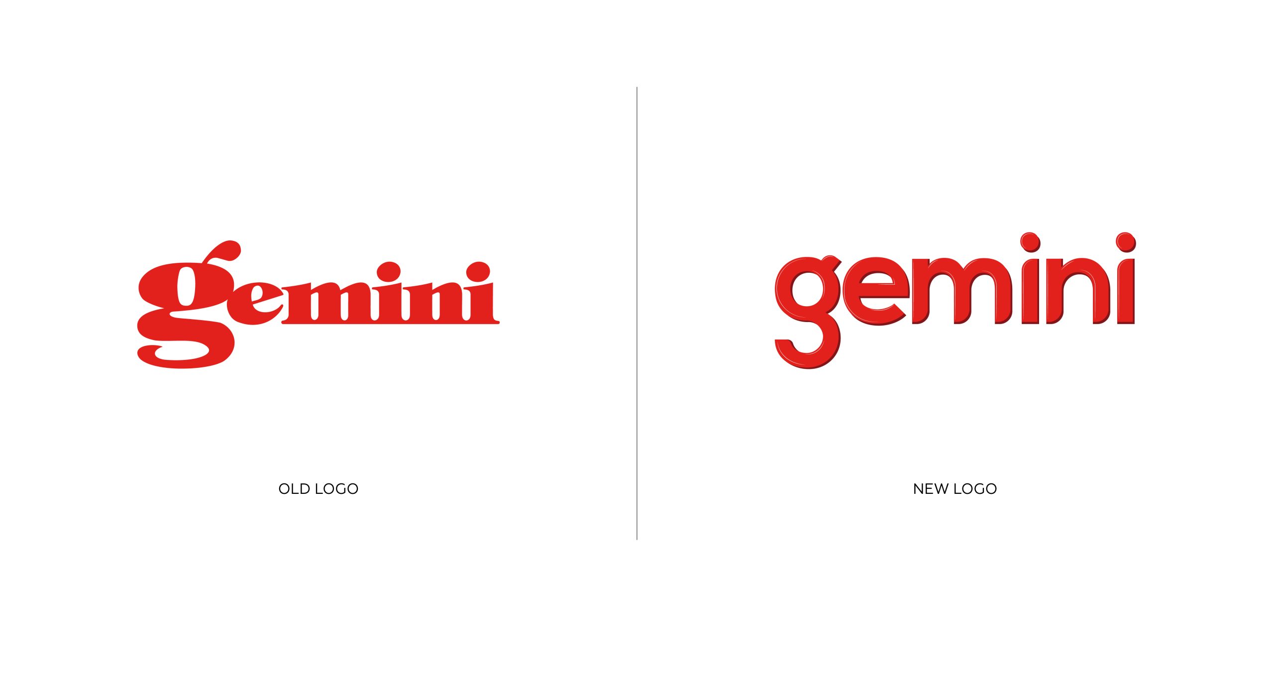
The new logo identity is a geometric form which cues balance and structure in a way that is strong yet approachable. The curves are also designed keeping in mind the nuances of the old logo to increase familiarity while ensuring newness. The type is contemporary and crafted to showcase balance as the key idea. The colour red was chosen for its strong connotations with food.
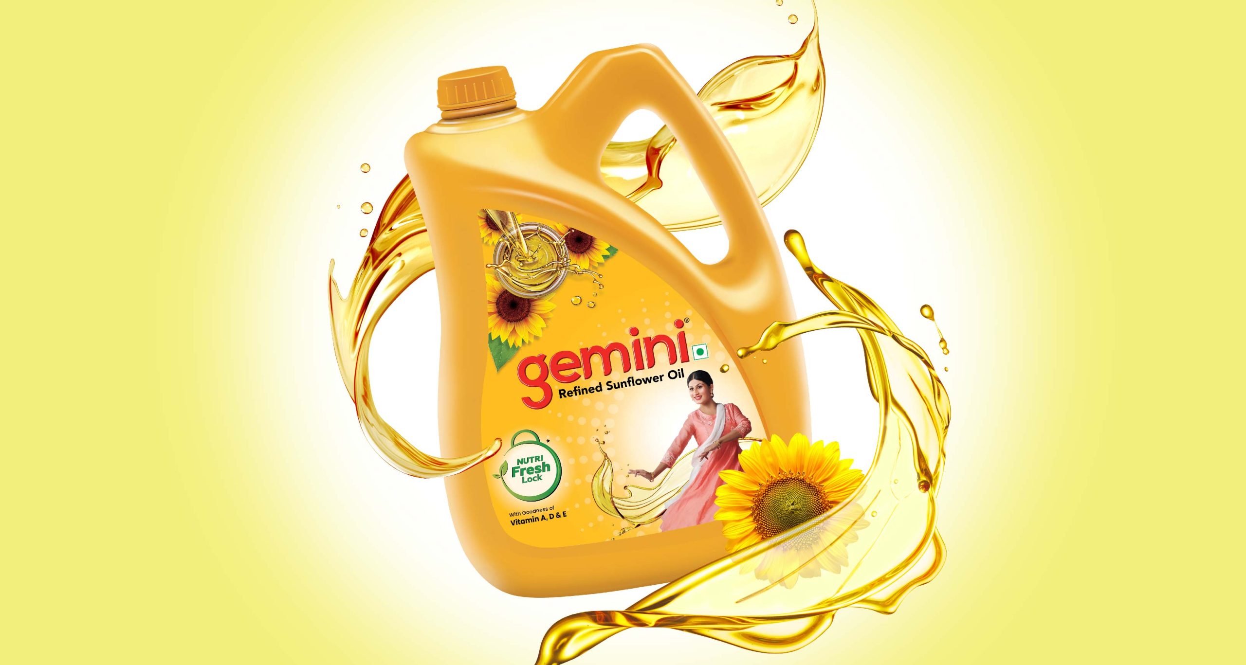
The top part of the pack represents time in the kitchen with the ingredient story and oil splash. The dynamic nature of the oil and its texture showcases lightness. The woman in a dance posture with an oil swirling element around her represents the fluidity that enables her to indulge in her passion smoothly without being tied down to the kitchen. The NutriFresh lock acts as a mnemonic for goodness that is present in the oils in the form of essential vitamins. Vibrant summery colours like yellow and green were chosen for depicting the quality of everyday lightness.
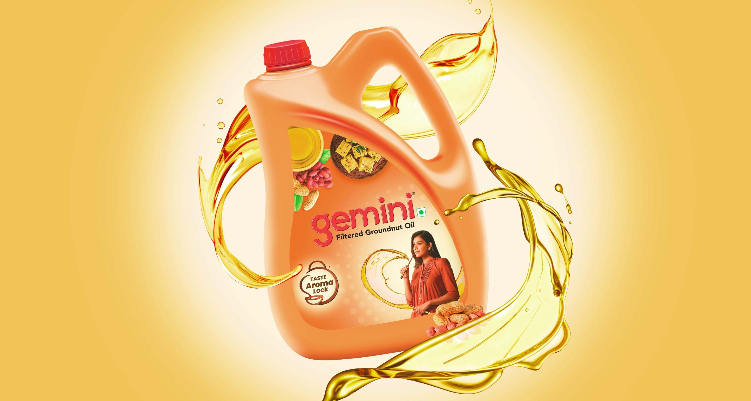
The food shot with the oil bowl has been added to connote taste factor in the oil. There is a change in the representation of elements like showing the woman pursuing a different hobby and a new mnemonic to cue aroma as another key benefit. The overall pack design has been retained, with changes made as per the key benefits and purpose of the product in the pack. Colours with a rich texture have been used to cue indulgence and flavours.
The main logo identity has an interaction of two weights of the font to gain an emphasis on “health”. An integration of logomark connotes horizon, giving a wholesome and forever like feel to the brand, as smart health management is a need for not just today but also tomorrow. The identity is designed to make the brand feel modern, distinct, unique and innovative.

An in-depth study of colour revealed Teal as the colour of choice for the brand. Just like the proposition, the colour Teal is balanced. It provides a calming and tranquil effect, an outcome we desired for the consumer. We wanted the consumer to feel liberated and experience a sense of fulfillment when they use the brand. Teal also represents cleanliness and elegance, qualities that are also seen in the progressive traditionalist woman. Teal is open-minded and not impulsive. It is forward facing and is also rooted in it’s own ways. It is creative and yet serious. This result of balance is what has been achieved for the visual identity of the brand.
On the packaging the shield along with the RTB and molecules symbolizes scientific future forwardness with a sense of scientific credibility, two desirable qualities appreciated by the smart consumer. The oil formulation also inspires confidence by visually depicting action and dynamism, cuing proactive lifestyle and health management. Similarly, the woman showcased on the pack also is seen running, which depicts health consciousness.