Transforming a legacy industrial company that has transformed India
Kirloskar, with it’s 100 years plus legacy has witnessed the birth, rise and transformation of India. Despite the changing backdrop of the country, the resilience of the brand has only stood the test of time and has emerged as a catalyst in India’s industrial growth engine.
In pursuit of encouraging national progress, the Kirloskar group of companies have diversified and grown multifold to introduce a wide range of products from diesel engines to electric motors; agricultural equipment to industrial scale refrigeration systems and from compressors to road railers. As consumers of global resources, it understands the need to conserve non-renewable resources and believes in social responsibility and sustainable business practices.
Kirloskar today, is a diversified conglomerate, and this also meant for us to be able to see the future-forward vision of it’s leadership, and bring alive this ambition through brand repositioning, visual language as well as architecture design.
The Challenge – Craft and Position all the business verticals in cohesion with a larger brand vision
One of the primary challenges was to transform a 100 years plus legacy brand by establishing a new vision. This included crafting and positioning for 8 business verticals within the group including new business ventures like real estate. The architecture also needed to be cohesive, bringing the vision alive across all digital and offline mediums, and shaping internal culture.
The Essence of Kirloskar – Designing the mother brand identity
The Kirloskar essence was built on three cornerstones – to constantly evolve, to create a better future and to bring delight. This also charted the core purpose of the brand, which is to create radiant futures, through deep customer centricity – both internal and external. We discovered the brand’s tone of voice to be that of The Relatable Sage. This is because at Kirloskar, the customer is at the heart of everything the brand does and is driven by a deep sense of empathy.
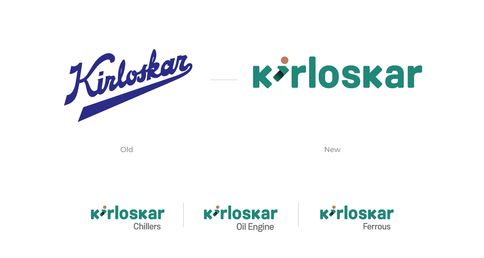
The Kirloskar i-mark is the symbol of that customer centricity. The human icon signifies that approach as a part of the new philosophy and the forward looking arrow showcases progression with growth. This also indicates the future forwardness of the brand and the extent it will go to impact it’s people, today and in the future. Combining both the ideas of centricity and growth, gives an ownable perspective to the “i” and a dimension showing a turning of a new page. This shows the transformation of the brand and through that the transformation of the lives it impacts. This unique rendition of the “i” also becomes an asset for the brand used across multiple touchpoints becoming synonymous with Kirloskar.
The Kirloskar architecture – Carrying the legacy forward and Beyond
With 60% visibility of the mother brand and 40% visibility of the child brand, these verticals carry the legacy of Kirloskar’s solid engineering background and are most established in the category. The Kirloskar architecture is designed to bring limitless possibilities from energy to innovative industrial solutions.
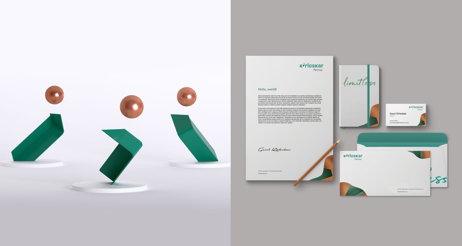
Limitless – From Philosophy to Platform
The new vision to bring customer centricity was translated to a new brand platform – Limitless. Limitless is the ethos of Kirloskar’s functioning everyday. It is about striving relentlessly to bring delight beyond boundaries to their customers. This wordmark thus becomes a playground for the brand to create and innovate.
The Kirloskar Identity – Colours and Type
We have used the copper patina colour palette. The pure golden red of the copper shows the legacy it carries and the teal depicts the years the brand has put striving to fulfill the dreams of lives that it has touched. The transition of the colours also signifies this transformation and the new journey towards a ‘Limitless’ future.
Weissenhoff Grotesk is a sans serif font that was chosen as the primary typeface to create the brand identity. It’s slightly rounded corners make it highly readable in various sizes, and yet offer differences that are subtle enough to stand. For Digital Fonts, Heebo has been used for it’s sharpness and crisp quality, thus enhancing the type system in digital communications.
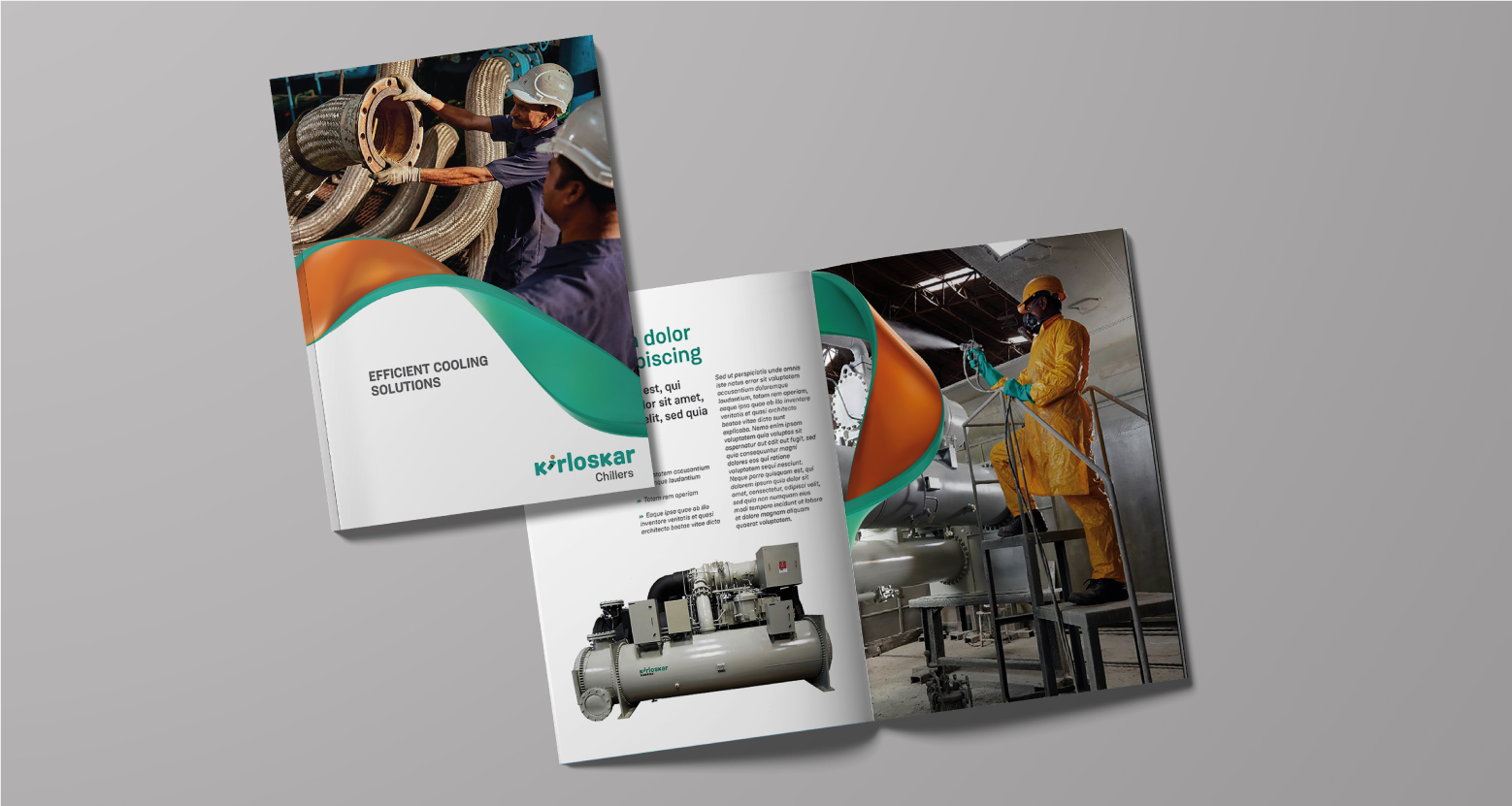
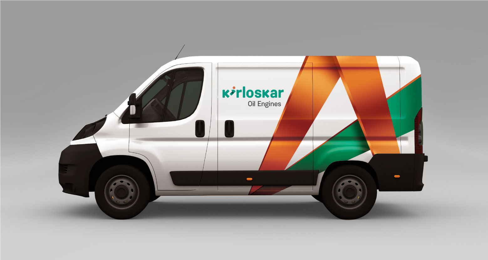
Kirloskar – A Visual Story
With this brand we wanted to create a visual world that showed “Limitless” and not just in imagery but in minute details like iconography. The visual imagery is rooted in actual moments of interaction with products with an optimistic and warm tonality. The look and feel of Kirloskar’s world is real, candid, happy and feel good. The composition and framing of the images is kept sharp, focused, with dynamic angles and a clear ample white space. These technical nuances are an embodiment of the brand’s values of innovation, clarity, future forwardness and empathy.