God took only seven days to make the world. But sadly, the running of the world, its World Bank, its IMF etc. was left in the hands of mortals. And despite well intentioned manifestos, the institutions that were created to aid and progress world economics and finance, ended up becoming agents of establishment and capitalism. Losing people’s trust with their stifling bureaucracy, lengthy decision-making and patronising tenor.
Fortunately, the old world order started shifting around the turn of the century, soon creating newer power centres of world economy – a younger, nimbler, shift of power known as the BRICS nations. Brazil, India, China and South Africa felt the need for an institution to aid development in theirs and other developing countries in a very new dynamic way. The New Development Bank, NDB.
Before we went for this pitch, we asked ourselves, can we let NDB end up looking and feeling like yet another feet-dragging, establishment monolith? For in stark contrast to the World Banks and IMFs of the world, which only lent in US dollars, in processes that took a year or longer, and asked in return for privatisation of and access to markets, NDB was meant to release funds to developing nations in local currency, and that too, within 6 months or less. The whole idea being, to enable partners to achieve their development targets swiftly.

If the “World Banks” were unapproachable monoliths, NDB stood for an approachable openness. The former were extravagant, NDB was smart and sustainable. In fact, it was a series of such antitheses. Bureaucratic, hierarchical and old vs. flat, transparent and youthful. Messiah complex vs. a collaborative, adaptive partner. Long processes vs. speed and agility. Authoritative and serious vs. transformative and egalitarian. Talking down on social media vs. engaging in conversations. Routine & Rigid processes vs. transformative and world changing.
And when it came to brand differentiation, the old world institutions had none. Be it the World Bank, IMF or European Bank, each brand identity used a similar colour palette. As a result none of them had a brand identity that matched a unique brand thought.
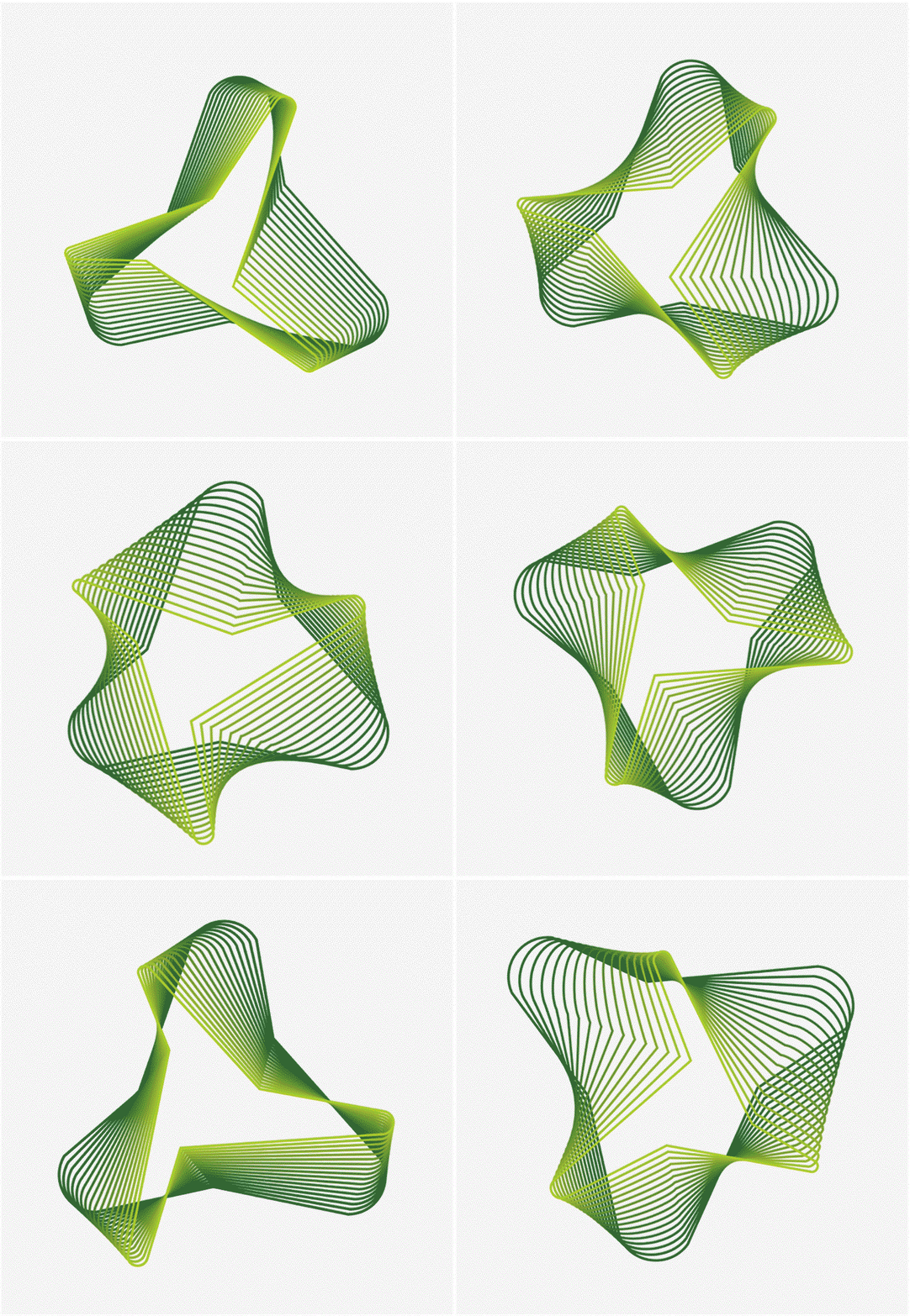
For NDB, the design principles that needed to be encoded we realized, were agility, innovation, sustainability and transparency. And this quest led us to the Mobius strip, a stable yet infinite form that symbolizes the idea of continuous transformation.
Its nature is not to disrupt, rather, it participates in the existing system and becomes the change. And this transformation was the inspiration behind the identity we created for NDB.
The new identity consisted of a triangle in motion at one end, signifying balanced evolution. A propeller at the other end signified speed and dynamism. The identity was held together by a wire-frame. The wireframe symbolized infrastructure, while the green colour embodied sustainability. And thus we’d encoded agility, innovation, sustainability and transparency in the new identity of NDB.


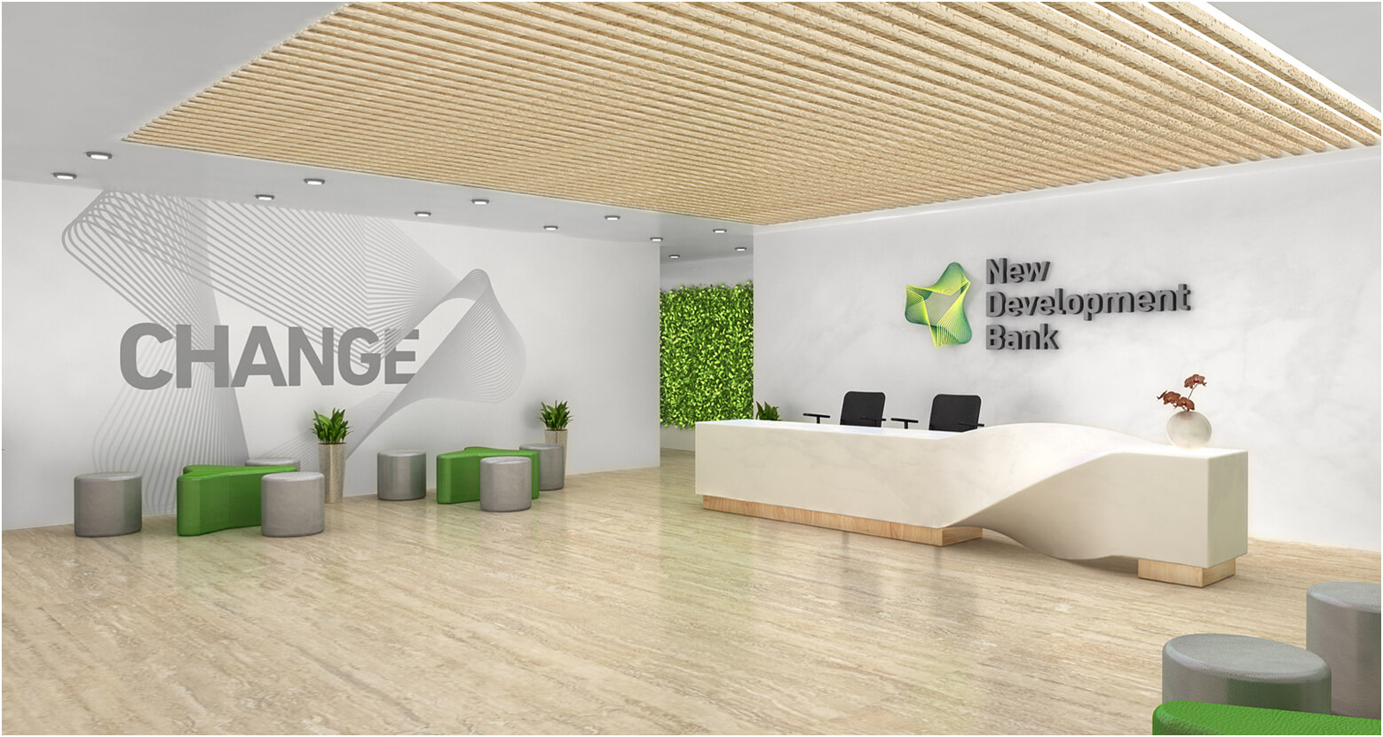
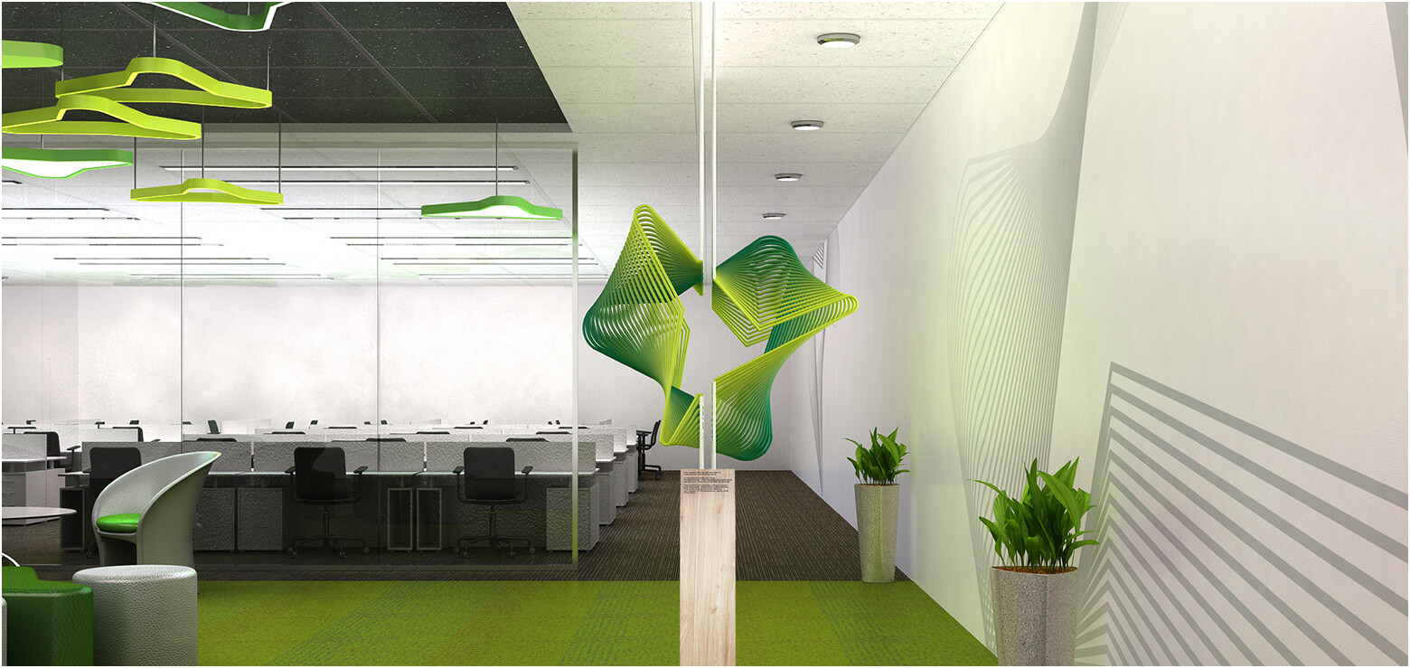
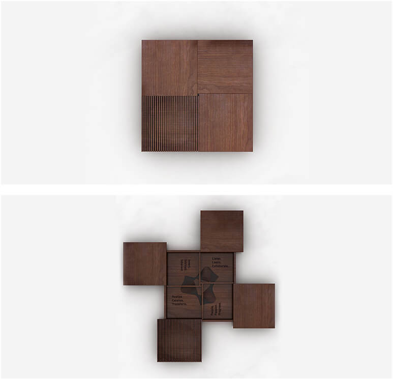
The NDB brand experience was extended with design guidelines, right from the offices to the furniture:
Light, natural shade of wood/veneer for the office furniture. (Read open, warmer, approachable).
No hard wooden doors, or closed spaces. Glass partitions to signify transparent ways of working. (Dark wooden texture, opaque partitions and solid locked doors to be avoided like the plague.)
Walls with raw concrete finishing, signifying honest communication.
Sleek, high back chairs for senior management rather than heavy leather thrones. (No heavy, plush sofa-like chairs please.)
Common areas to be green, with natural partitions marking the area, highlighting the focus on sustainability.
Meeting / conference rooms to feature no single head of the table. As also, ergonomically designed, low back chairs (without a head).
Light office furniture, glass tops and light frames.
Open office, work stations with minimal partition heights.
Oh, and did we mention, in this pitch contested by 16 agencies worldwide, including one not even belonging to the BRICS nations, we won while being the only agency that did not show designs.