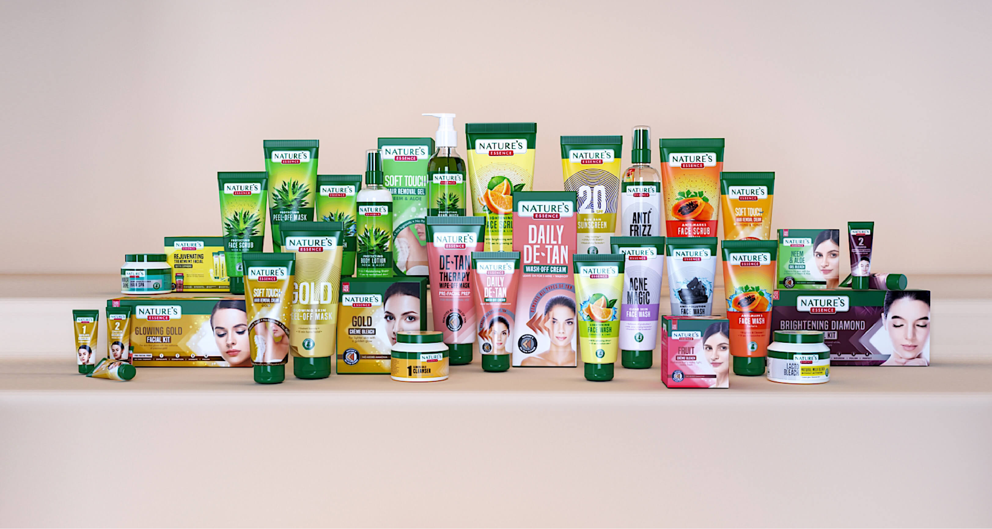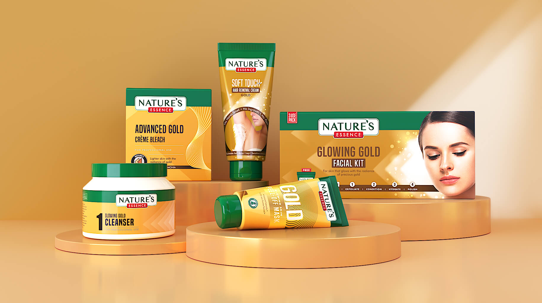
Nature’s Essence is a personal care brand with a network of over 150,000+ retailers and 60,000+ salons in India. Over two decades, the brand expanded its portfolio by quickly responding to every category led demand that emerged. While the product range grew exponentially – the challenge that emerged was a lack of harmonization across the brand. The key tasks were to redefine the brand identity and then, organize 120+ products across 2 categories and 6+ sub-ranges into a consolidated & unified brand architecture system. The goal was to diversify packaging to attract an audience beyond salon owners and retailers targeting the consumer facing space.
First we gave the identity a face lift – we retained what was needed and refreshed what was dated. Next, we looked at the whole idea of “Nature & Science” coming together and decoded it in a manner that depicts the gentle yet powerful force of nature that is amplified by science. With the foundation of “Potency of Nature” as the core brand philosophy – we built two differentiated categories across multiple sub-ranges that drove home the idea.
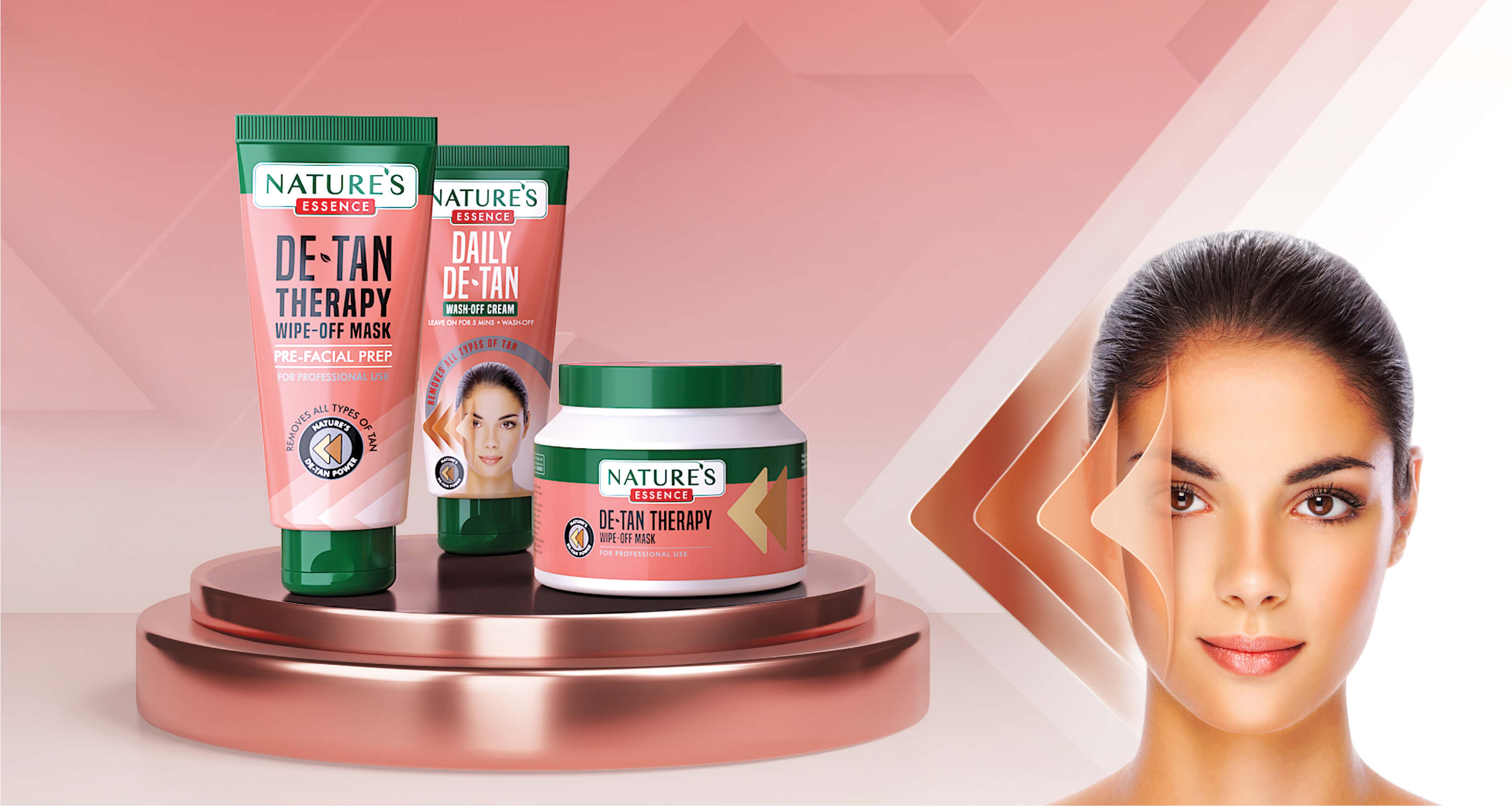
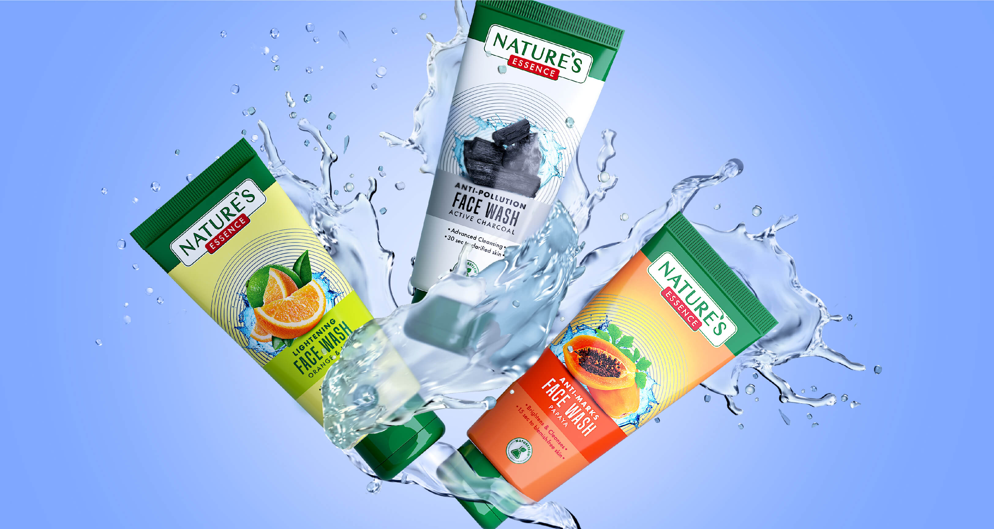
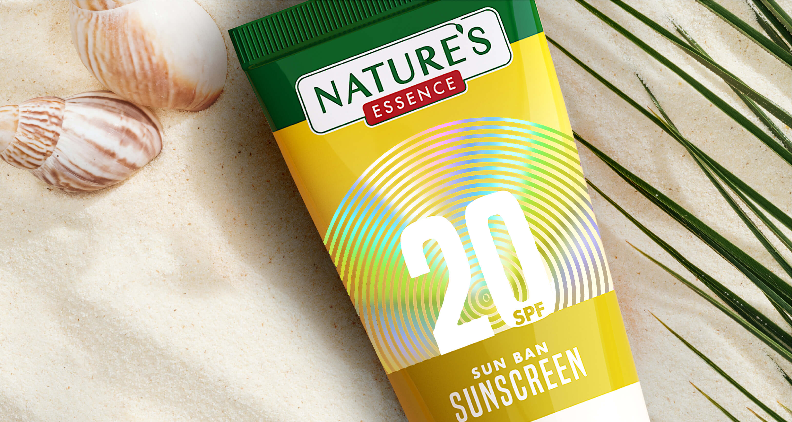
With our brand design strategy in place we then created a packaging system that embraced this new philosophy. Our design research and insight generation helped define a system that made each product and sub range mutually exclusive while retaining a collectively exhaustive brand narrative. We also created a set of brand assets, complete with mnemonics that strengthened the brand story & translated it seamlessly across all touch points.
The rejuvenated brand has a vibrant visual language that distinguishes between the sub-ranges while cohesively tying the vast portfolio together. The core design assets have been seamlessly translated to their website and extended to their advertising campaigns infusing the brand with an overall youthful vibe making it contemporary & lively.