Kellogg’s wanted to bring the most premium looking, indulgent and chocolaty breakfast experience that consumers just cannot say no to. The one-line design brief was to ensure it’s distinctive identity as a variant while leveraging the superiority of Kellogg’s in the Breakfast segment. Taking forward a winning design architecture of the brand and extending it to a new and exciting variant, DY delved deep into the heart of the brand.
We had two major tasks to do. First, was to translate the superiority of Kellogg’s chocolate muesli visually on the packaging, establishing it as “the most chocolaty muesli”. Second, address the creative challenge of balancing out the health and nutrition associations with Muesli and indulgence codes of chocolate.
As a part of the design immersion process, we deep dived into a few brands in India and internationally to understand the category codes. Chocolate emerged as an intrinsic superfood story given the inclusions like nuts, berries, seeds and grains. Given it’s antioxidant profile, Chocolate in small quantities also leads to a health and nutrition story. We aslo realised from residual knowledge and consumer immersions that Chocolate uplifts mood and enhances positive emotions.
Design immersions gave us insights such as usage of metallic hues in packaging to connote royalty and regality while deeper shades of blue and purple cues premiumness, richness and luxury. The semiotic decode also revealed an extensive usage of such colours and imagery that cue temptation, wholesomeness and nutritional credibility apart from indicating the larger need of sustaining an active lifestyle as informed by the consumers.
Design Route
While addressing the brief and the challenge, we were to follow current visual language and hierarchy of the core range.Here the major challenge was to deep dive into the chocolate category and figure out catetogory code while being clutter breaking.
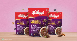
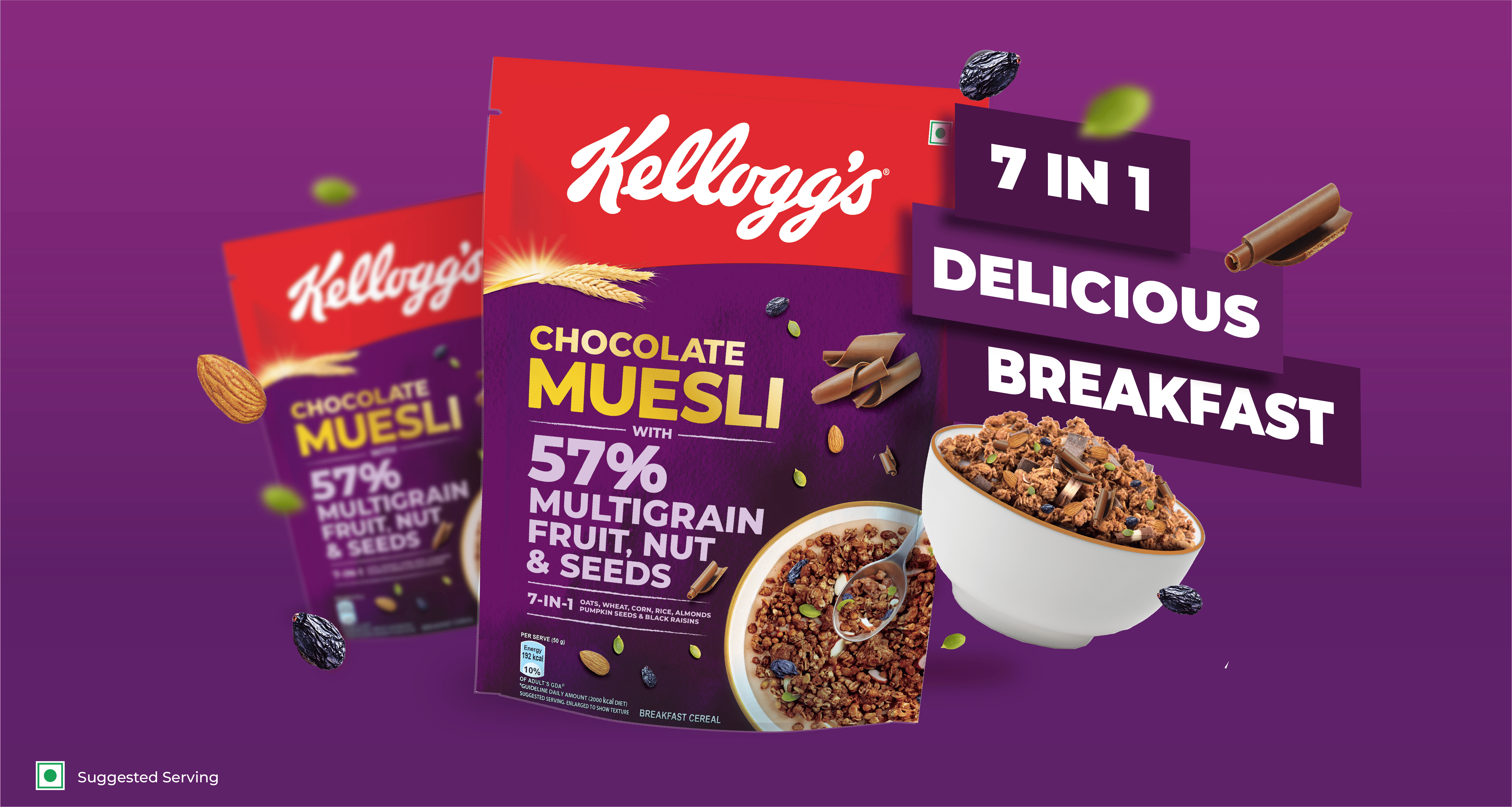
The design route involves a top shot of the muesli bowl with a spoon, capturing the breakfast moment at the table. The arrangement of chocolate chunks, fresh raisins, and pumpkin seeds is meticulous, creating an inviting visual feast. A close-up macro shot of the ingredients aims to evoke a moment of mindful indulgence and excitement during breakfast.
The regal purple hue chosen for the packaging embodies a sense of premiumness and royalty, while the addition of handmade watercolor textures enhances authenticity and imparts an indulgent quality. The overall design aligns with the brand’s existing visual language and hierarchy, ensuring a cohesive and distinctive identity for Kellogg’s Chocolate Muesli.